Assignment 1: Bad PhotosTim Aiken: Column | ||
|
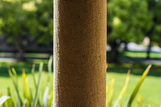
This photo fulfills the badly composed criteria, with the column placed directly in the center of the photo. Especially with the light hitting one side of the post, it would've made sense to place it on either side of the image, as an asymmetrical location would play well with the asymmetrical nature of the stone. | ||
| << Previous | Back to All Photos | Next >> |
