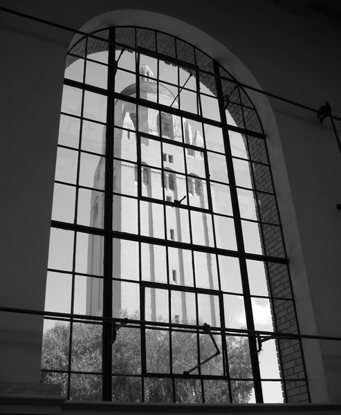
Assignment 4: ArchitectureJesse Birbach: Framed Hoover Tower | ||
|
Like several other of my photos, I shifted this photo to B&W because the colors were pretty bland, but the lines were very strong. I used a smaller aperture to maximize my depth of field. Finally, I cropped down the image to feature the framing. | ||
| << Previous | Back to All Photos | Next >> |
